CMS · Design System
NDA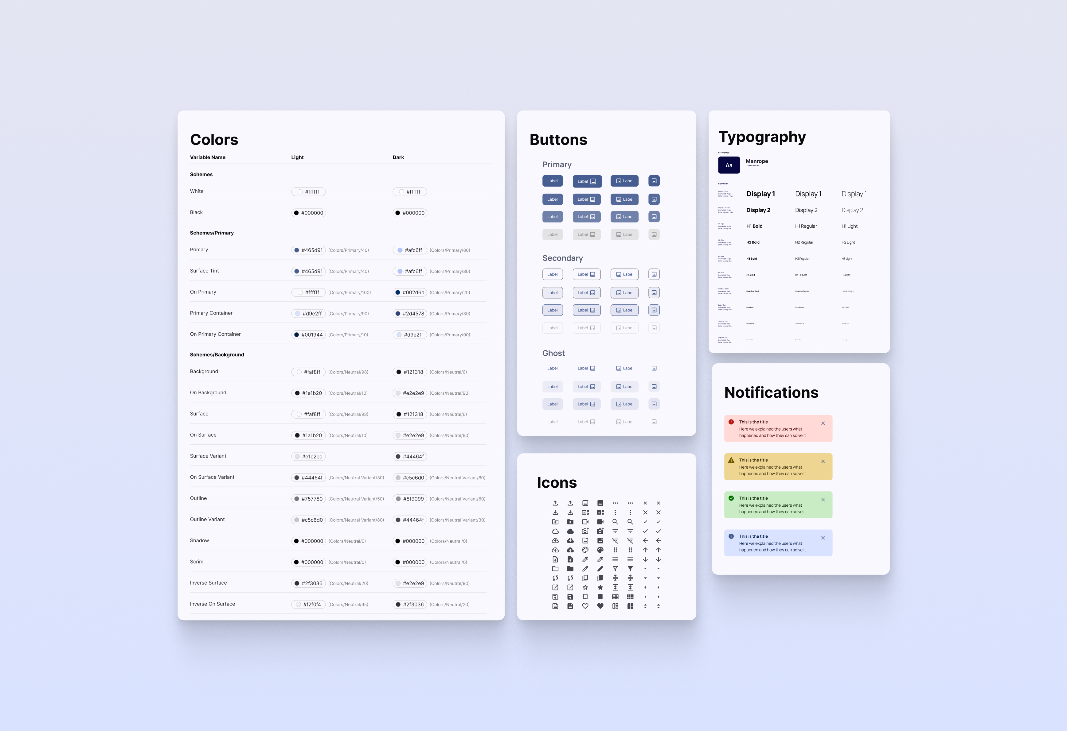
One System.
Every Platform.
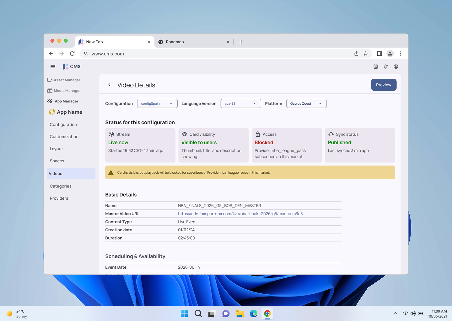
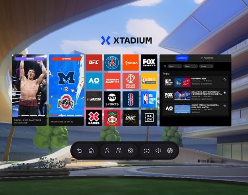
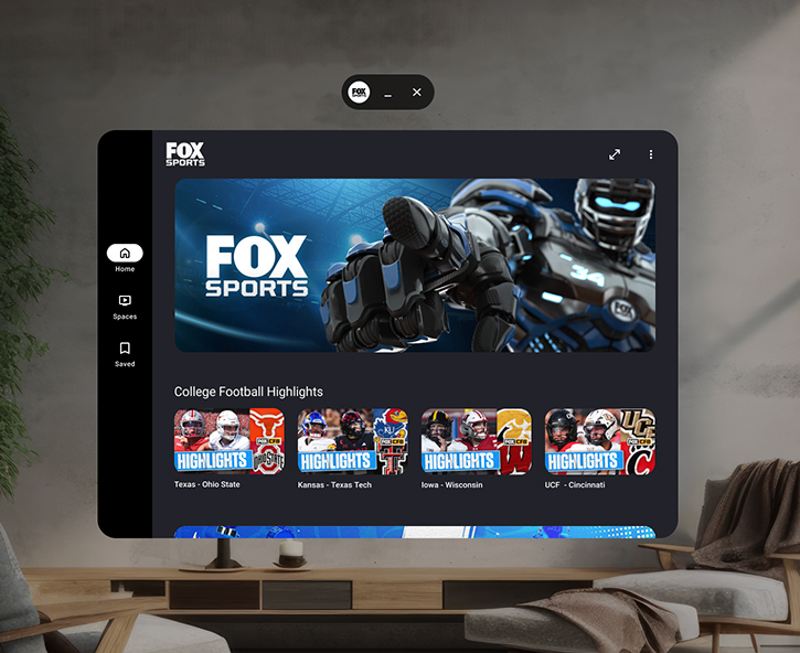
The backbone of a live sports streaming operation: content ingestion, metadata, and multi-market publishing for 5 apps in production, each spanning some combination of up to 5 platforms (iOS, Android, Meta Quest, Vision Pro, web). For years, it grew with no UX owner, one screen at a time.
The internal Content Management Platform powering 5 apps in production, each spanning some combination of up to 5 platforms (iOS, Android, Meta Quest, Vision Pro, web), had no shared UI foundation, every engineering team built its own version of the same components, with no one accountable for consistency once a feature shipped.
I led the design system that gave them one: a token architecture, a component library, and the governance model to keep it that way after I moved on to the next feature.
Design System Steward, UX/UI Designer, Product Designer
Solo UX/Design ICBackend Engineer, QA, Operations Staff, Frontend Developer
Figma, FigJam, Jira, Confluence
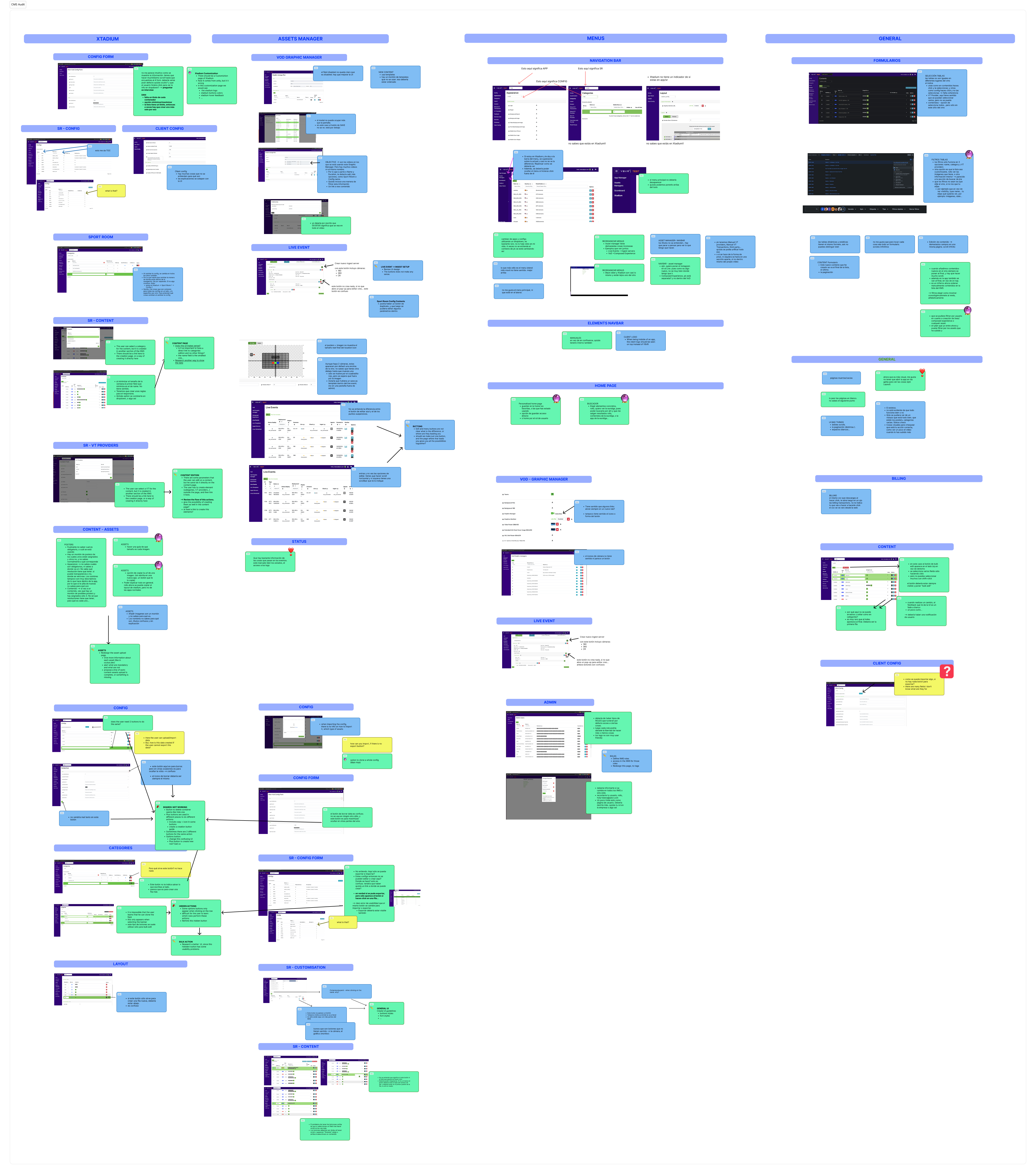
5 developers, 5 different buttons. No shared tokens, no naming convention, no ownership model, every new screen introduced its own visual dialect.
A 4-layer token architecture, a 40+ component library following Atomic Design, and a governance model sized for a small team, not an enterprise process.
New screens are built with the design system by default. Onboarding for new Operations staff dropped from weeks to days.
Quick look:
See the full before/after ↓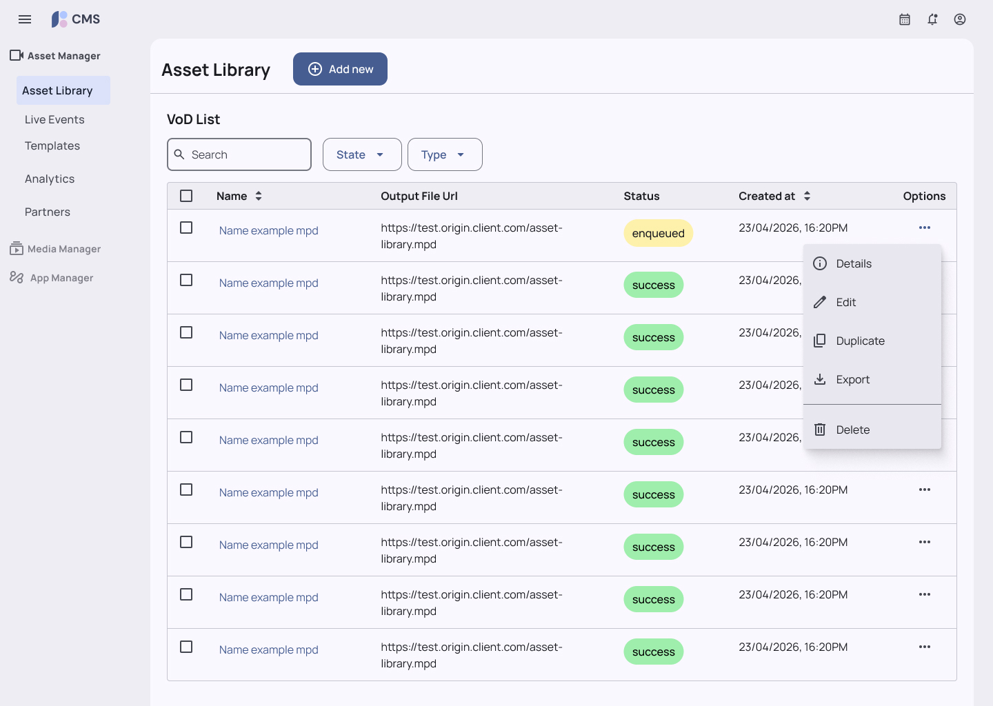
Research & Insights
The same discovery process behind the Content Platform redesign (a heuristic audit plus interviews across every role that touches the CMS) surfaced a second, separate problem underneath the UX issues: the UI itself had no shared foundation.
- Every developer had shipped a different version of the same shared components
- Errors surfaced downstream, in backend logs, not in the UI itself
- Layout and interaction patterns varied screen to screen with no shared reference
5 developers had shipped 5 different versions of the same primary button, different color tones, different border-radius values, no single source of truth. The fix wasn't a UI cleanup. It was ownership.
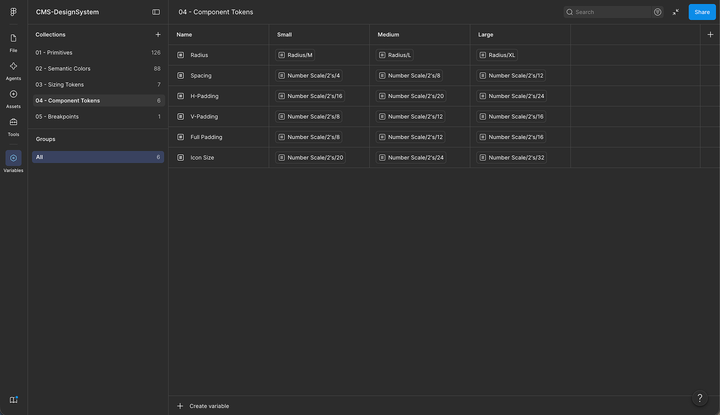
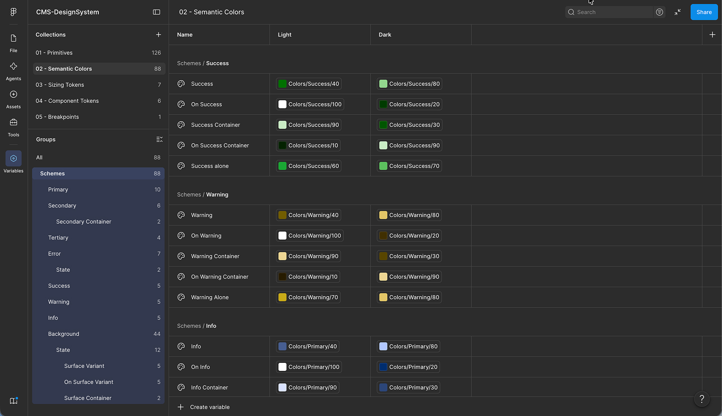
Foundations & Tokens
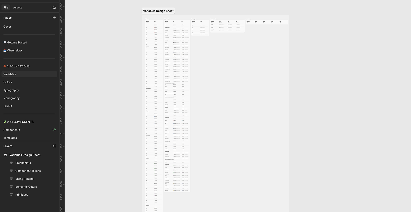
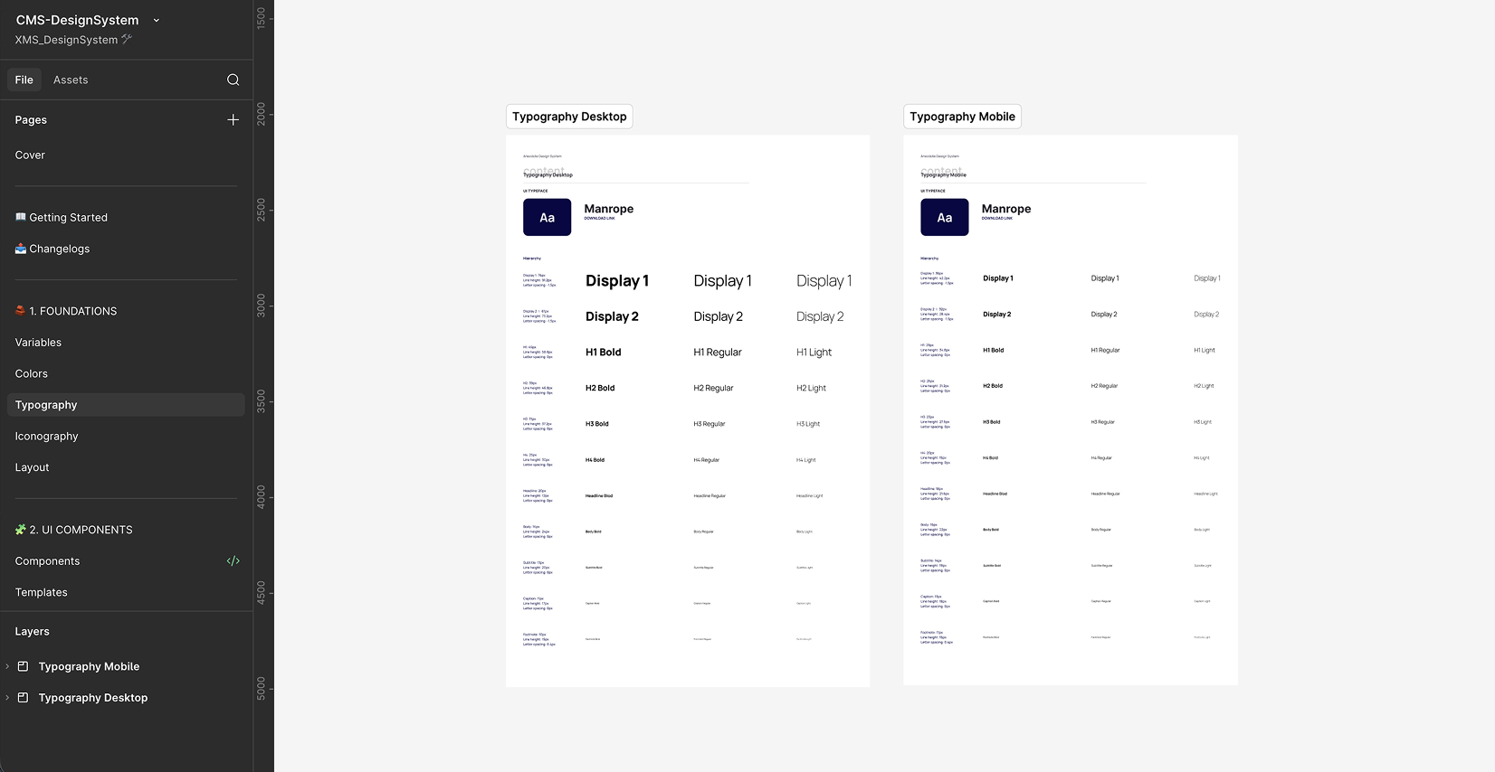
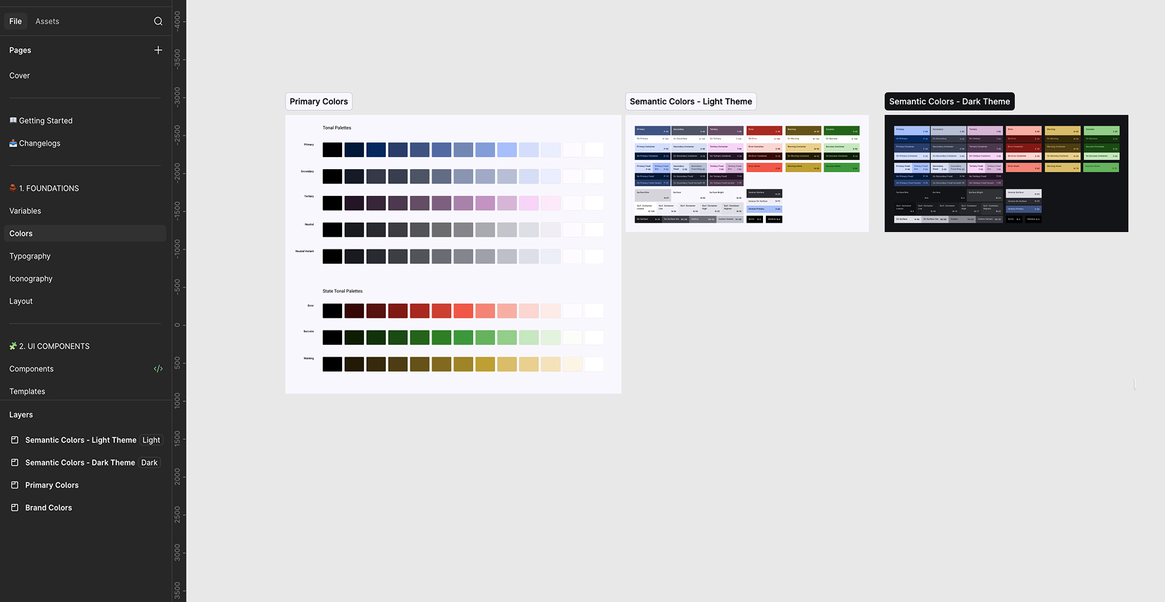
I defined how color, typography, spacing, and state tokens flow from primitive to component, keeping design and engineering aligned on a single source of truth. Those same token names later became the shared vocabulary that kept the Figma library and its Storybook implementation in 1:1 parity. Color contrast, state variants, and minimum interactive target sizes followed Material Design's accessibility guidelines throughout.
Component Library
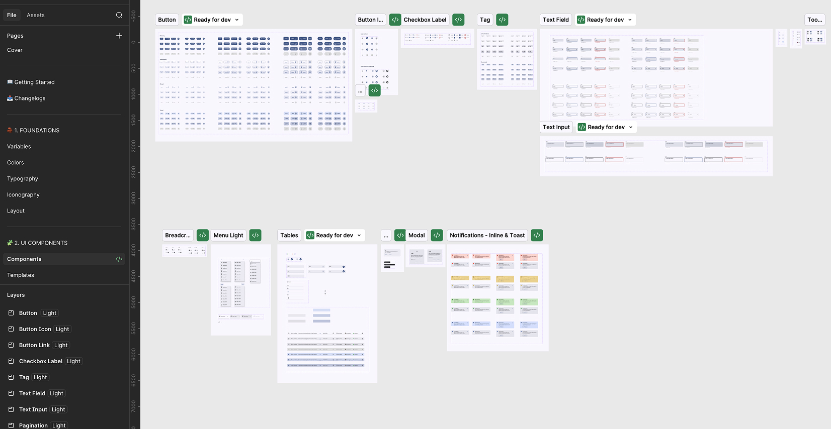
I built a 40+ component library following Atomic Design, each with defined states (default, hover, focus, disabled, error) and a documented naming convention shared between design and engineering, so the button that shipped 5 different ways only had to be designed once.
| Level | Components |
|---|---|
| Atoms | Buttons, Checkbox, Forms, Logos, Pagination, Radio, Tags, Toggle, Input, Label, Icon, Badge |
| Molecules | Breadcrumbs, Menu, Tables, Tooltips, FormField (Label + Input + Helper), SearchBar (Input + Button), FilterChip, DataTable Row |
| Organisms | Modals & Notifications, Sheets, DataTable (with sorting and filters), MediaSelector (thumbnail picker with preview), CountrySelector (multi-selection with validation) |
| Templates | DashboardLayout, ConfigWizard, BulkEditScreen, AuditLogView |
| Pages | Event Configuration, Thumbnail Bulk Editor, App Settings |
Figma Project Preview
Audit Log
The AuditLogView template above exists because errors were surfacing downstream, in backend logs, not in the UI itself. Every change to a live event needs a record of who did what and when, so an incident during a live broadcast can be traced back to a single action instead of a guess.
| Timestamp | User | Role | Action | Item | Change |
|---|---|---|---|---|---|
| 2026-06-14 19:32 CET | j.smith | Ops Lead | Published | NBA_FINALS_2026_G5 | Status: Scheduled → Live (configSpain) |
| 2026-06-14 19:34 CET | a.lihn | Operator | Edited | NBA_FINALS_2026_G5 | Thumbnail: replaced (spa-ES) |
| 2026-06-14 19:41 CET | system | — | Sync Error | NBA_FINALS_2026_G5 | Provider block: nba_league_pass (configSpain) |
| 2026-06-14 19:52 CET | d.sanchez | App Manager | Edited | Providers · NBA | Blocking provider: added (Config UK) |
Every write action, publish, edit, sync, is logged with who, what, and when. That's what let the Ops Lead trace the blocked-provider incident above back to a single change in a single market, instead of guessing across 5 apps and 12+ configs.
Where I Went Deep: Notifications & Tables
Not every screen justified a full redesign. Using the same Ops-impact / dev-difficulty / design-effort lens from the research phase, two areas stood out as worth a deeper redesign rather than a component-level fix.
Note: a brand refresh landed partway through this project, since the product logo moved from green to blue. So part of the color shift visible in the before/after comparisons below reflects that rebrand as well as the design system work itself.
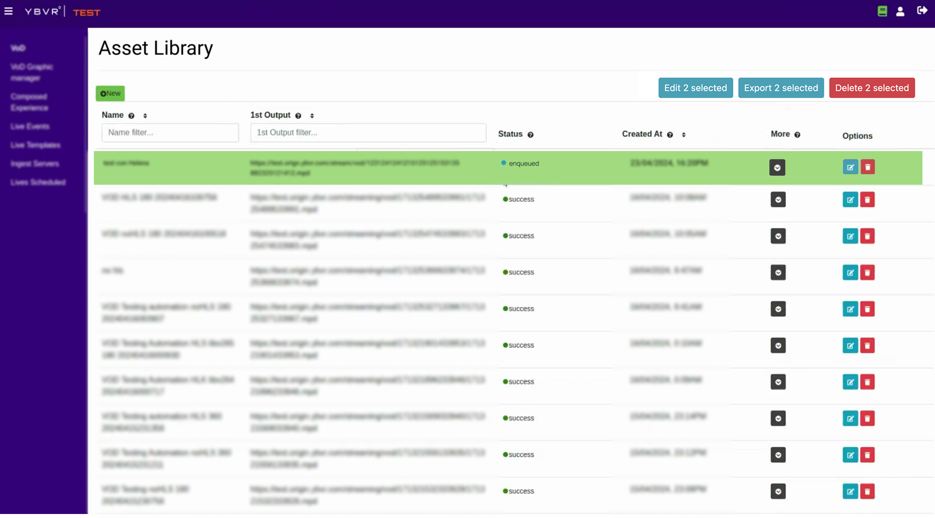
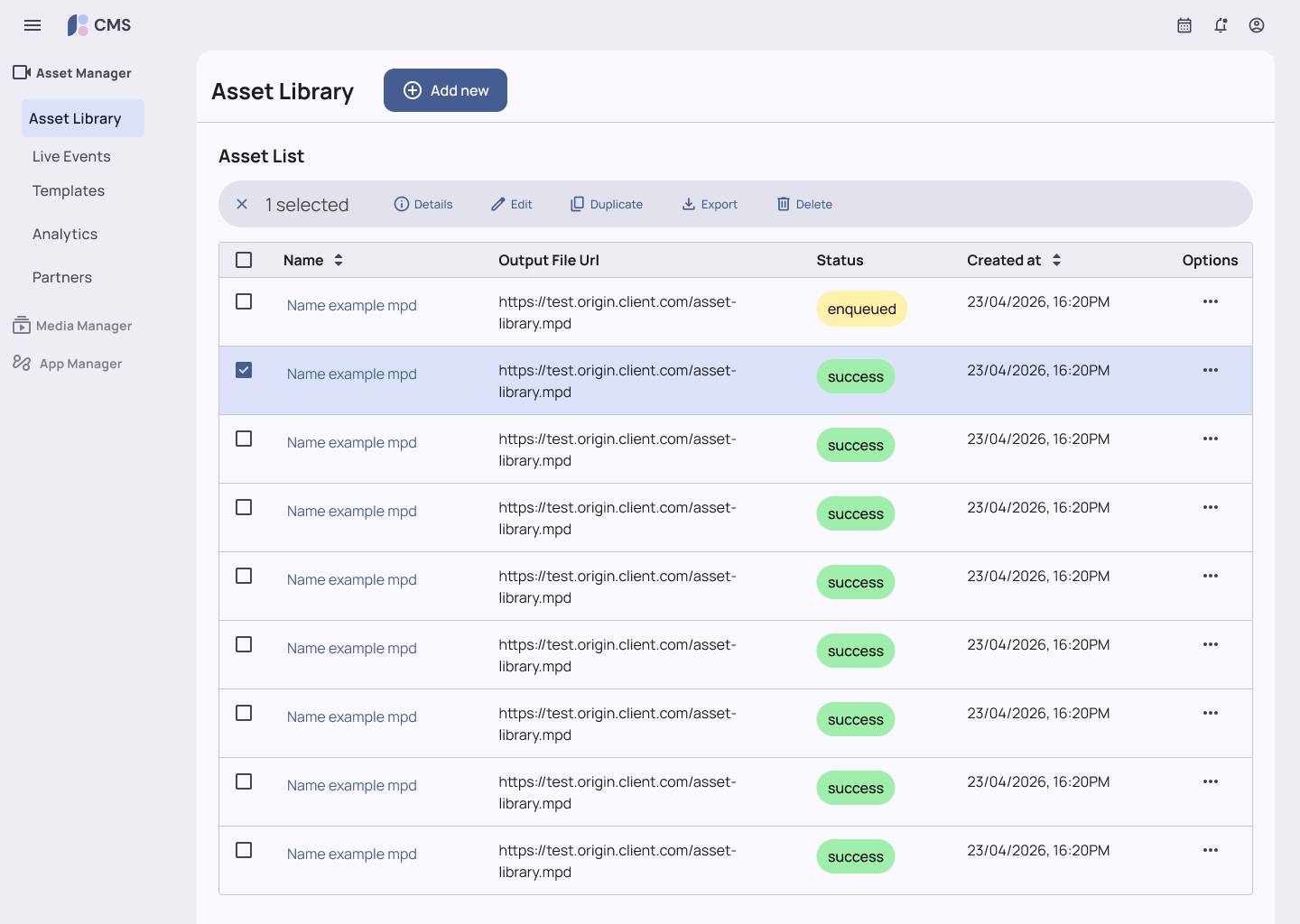
Tables
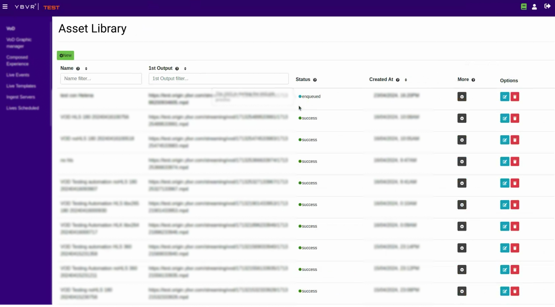
There were more than 5 different table styles across the tool, each with its own set of options. Bulk edit was available on some and not others, with no way to tell without trying. Icons were the biggest offender, the same icon worked as a clickable action in one table and as a static status badge in another.
I designed a single table pattern that's used everywhere now. Every row action lives under one More menu that opens beside the row with that item's specific options; Name and other identifying fields link directly to the item's detail page; and badges and buttons are visually distinct so no one has to guess whether an icon does something or just describes something.
Row actions: scattered icon buttons → single More menu
Bulk actions: inconsistent → always available
Notifications & System Feedback
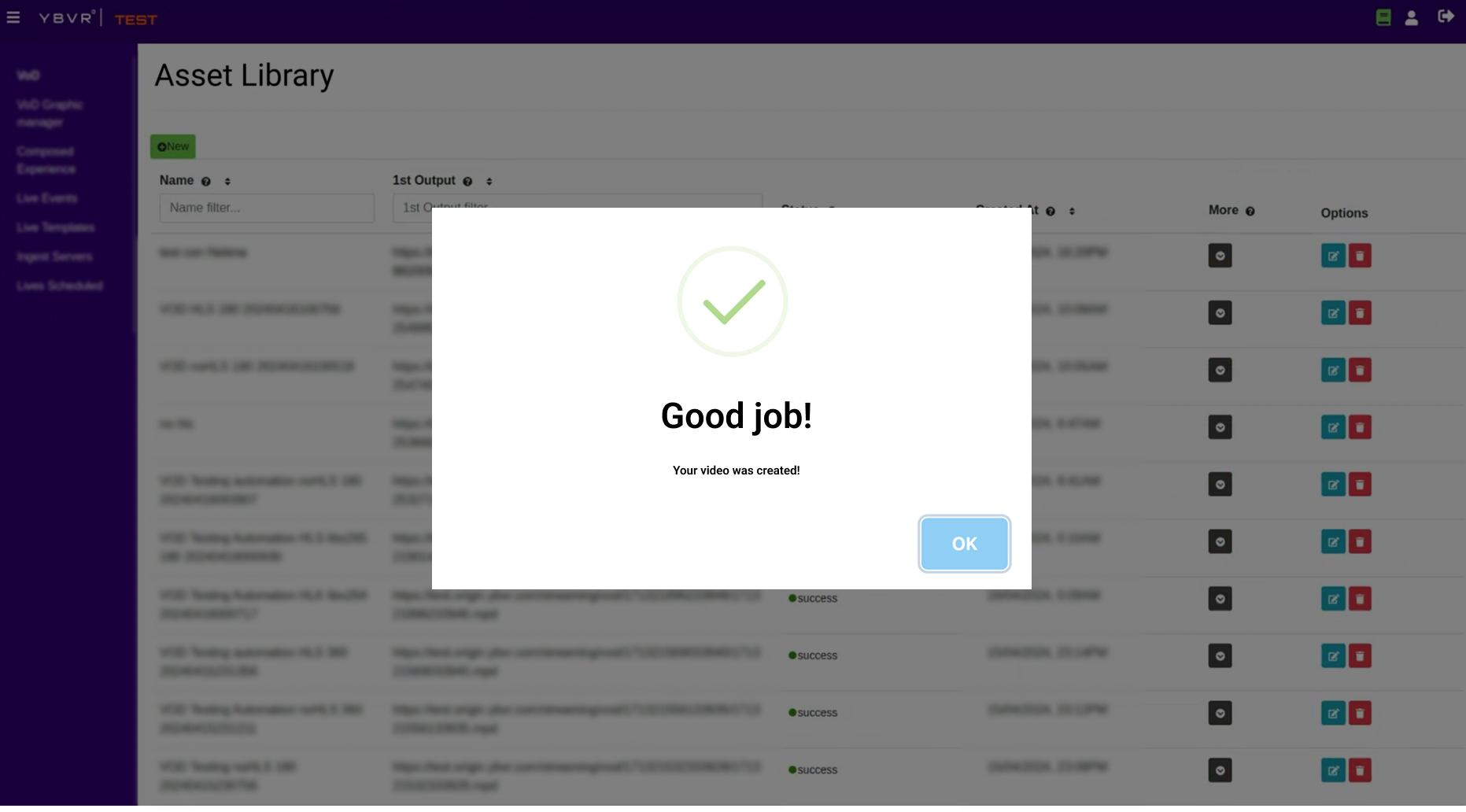
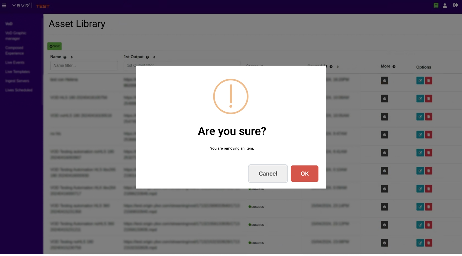
Every system message, a success confirmation, a destructive-action warning, even moving to the next step of a form, used the same modal. Nothing was differentiated by urgency, so everything felt equally high-alert, and every single one interrupted the user's flow.
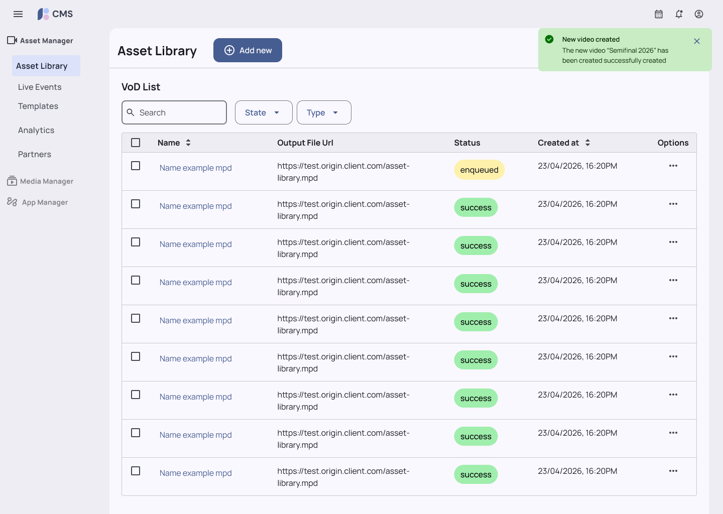
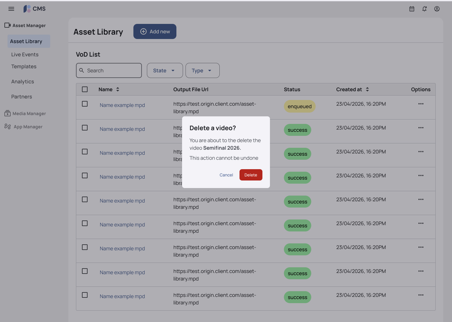
I designed a notification system with distinct patterns: toasts, inline banners, form error states, and modals reserved for what actually needs to block the flow. Also classified every message so design and engineering could agree on which pattern to use before a screen shipped.
Success message: modal → toast
Destructive action: vague → informative
Figma–Storybook Alignment
Design and engineering kept the Figma library and its Storybook implementation in 1:1 parity, matching component names, matching variant and state structure, matching prop names, so a component's design spec and its coded implementation could be cross-referenced without translation. That parity is what made the governance model enforceable: a proposed component couldn't just look right in Figma, it had to map cleanly to a real, buildable prop structure before engineering would vote it in.
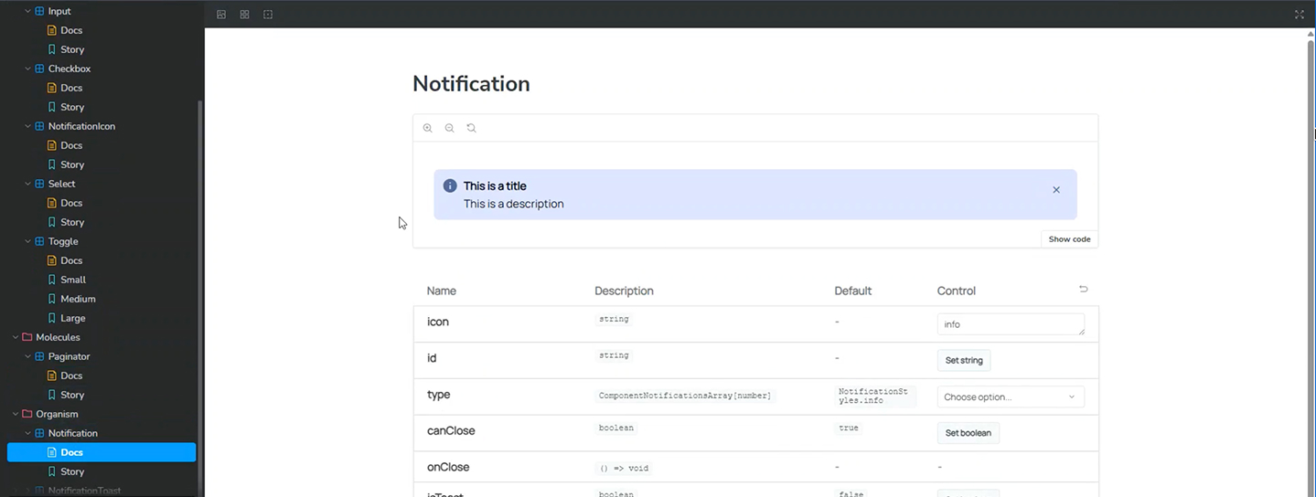
The Naming Convention Had to Be Renegotiated Mid-Project
The first naming convention was agreed on with the CMS/web department alone, until client-side teams (iOS, Android, Meta Quest, Vision Pro) started consuming the same component names through the API and found some already meant something else internally.
Several components had to be renamed, this time with consensus across every platform team. In hindsight, client teams should have been at the table from day one, not brought in after the taxonomy was already locked down.
Governance Model
Components are easy. Governance is hard. I designed a lightweight governance model appropriate for a startup environment.
Ownership
- UX team as initial DS stewards
- Each squad can propose new components
- Engineering has vote on technical feasibility
Versioning
Semantic versioning: v1.0, v1.1, v2.0. Public changelog visible to all designers and developers.
Adoption Strategy
- Initial training session for 3 operators
- Weekly office hours (Fridays, 30 min)
- Documentation in Confluence with live examples
- Health metrics tracked: % of platform components vs. custom
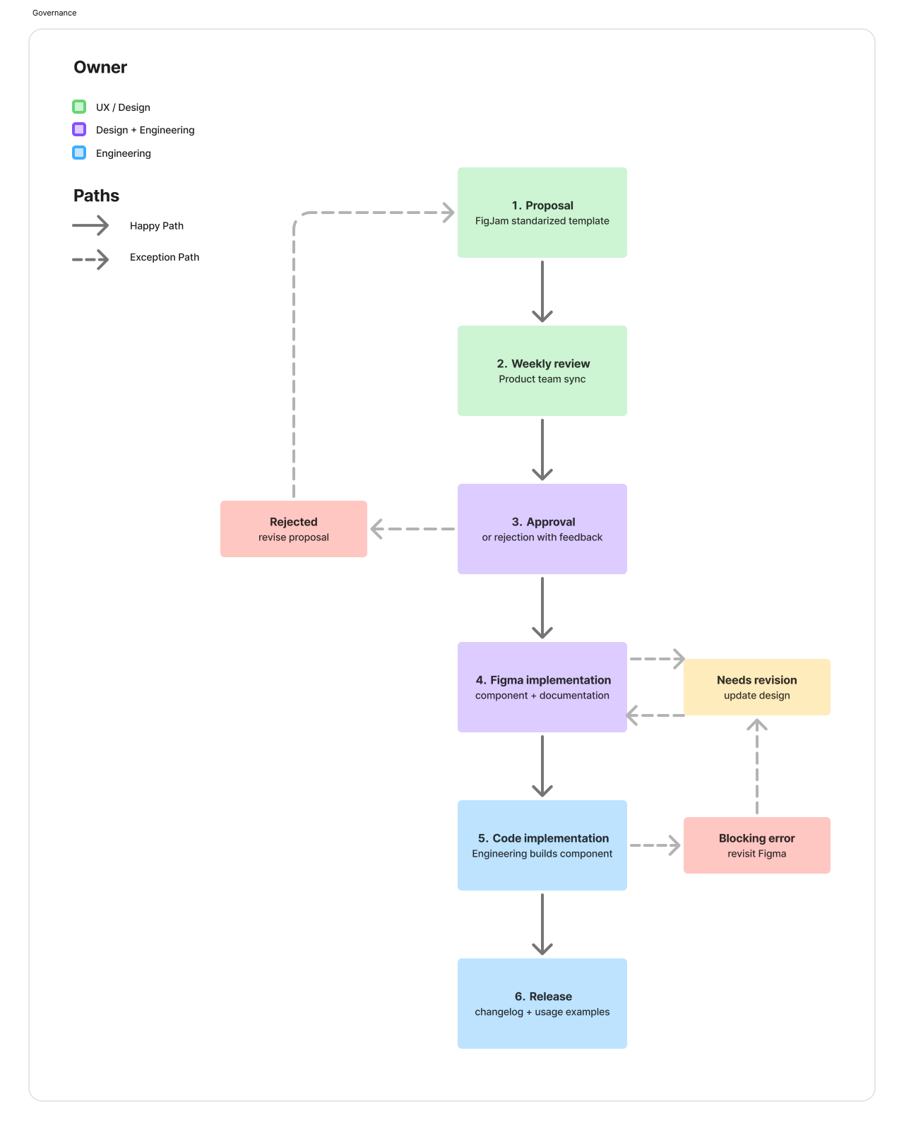
Impact
Confirmed figures, plus qualitative outcomes observed by the team since the redesign shipped.
Post-Project Reflection
Governance was 80% of the value, not the components.
A perfect component library with no adoption strategy is useless. Training, office hours, and living documentation did more for long-term consistency than any individual component.
Prioritize. You can't fix a legacy system all at once.
Designing for legacy environments requires prioritization. Not everything can be fixed at once: the Ops-impact / dev-difficulty / design-effort framework made the scope achievable instead of infinite.
The best ideas came from watching people work.
Collaborative sessions with backend engineers and operations staff were essential. The best ideas came from observing how they actually used the CMS, not from asking them about it.