Pulse
NDA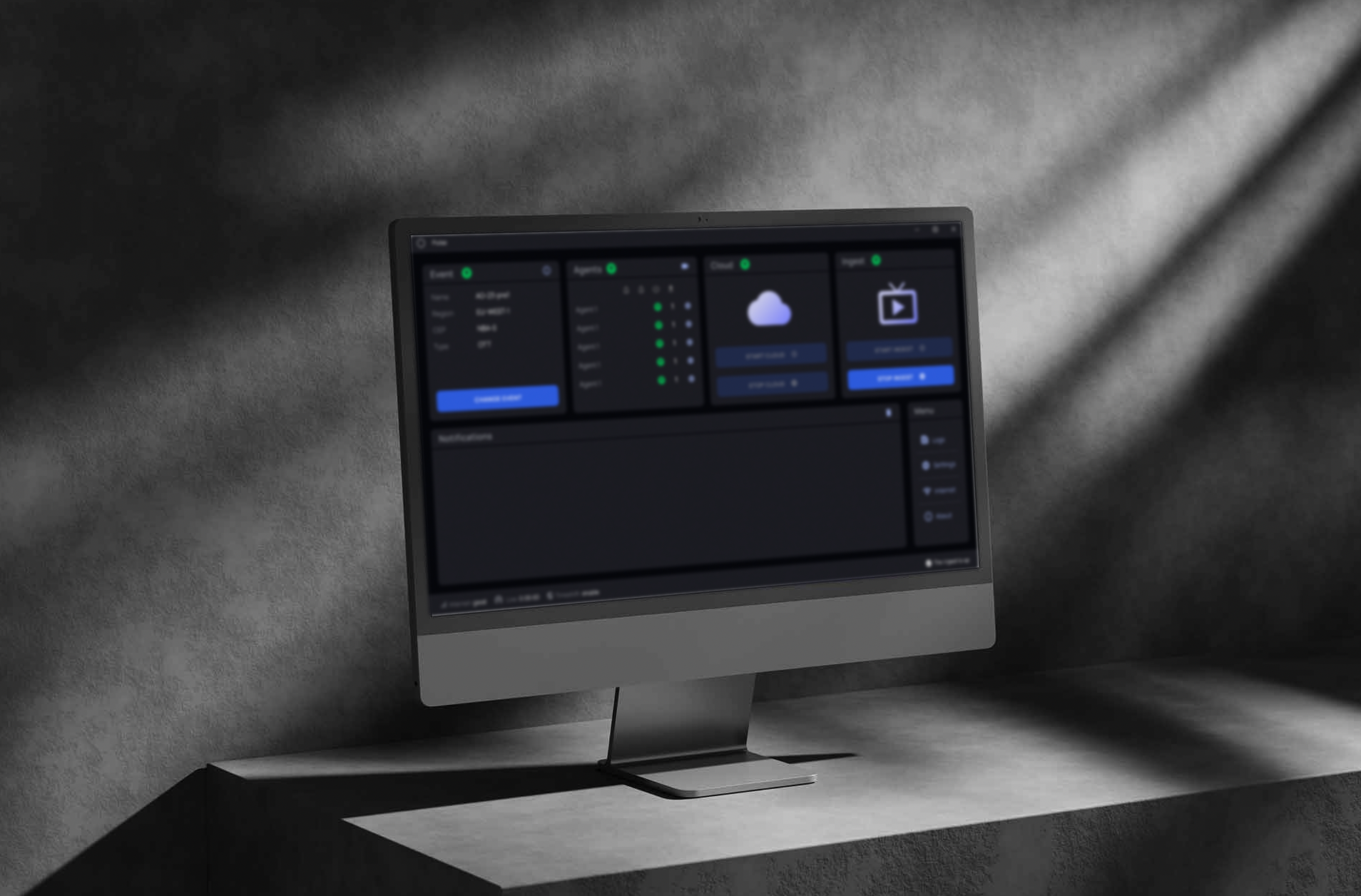
Monitor. Control.
Optimise.
Pulse is an internal tool used by operations staff to manage live and on-demand video streaming workflows. The redesign modernised the UI, improved usability for non-technical users, and enabled more reliable stream management across a growing platform.
Pulse is an internal tool used by the operations staff to manage live and on-demand video streaming workflows.
Initially developed without UX guidance to simplify manual processes, the app had become outdated, unintuitive, and difficult to maintain.
I led the redesign strategy end to end, from research through final design, working closely with engineering and operations to modernise the UI, improve usability for non-technical users, and support more reliable stream management across a growing platform.
Researcher, UX Information Architecture, UX/UI Designer, Product Designer
Solo UX/Design ICEngineer, QA, Operations, UX
Figma, FigJam, Jira, Confluence
An internal tool for managing live and on-demand streaming had grown without UX guidance. Non-technical operators couldn't read machine or process states, and raw logs weren't actionable during time-sensitive live operations.
Interviewed stakeholders and operators, mapped the start/stop-stream flow and system architecture, then designed a color-coded status system and severity-based log hierarchy, reorganizing navigation around Machines, Processes, and Monitoring.
Operators got at-a-glance system status instead of raw logs, fewer errors during stream setup, and less day-to-day dependency on backend support to troubleshoot.
Quick look at what shipped
See the full design ↓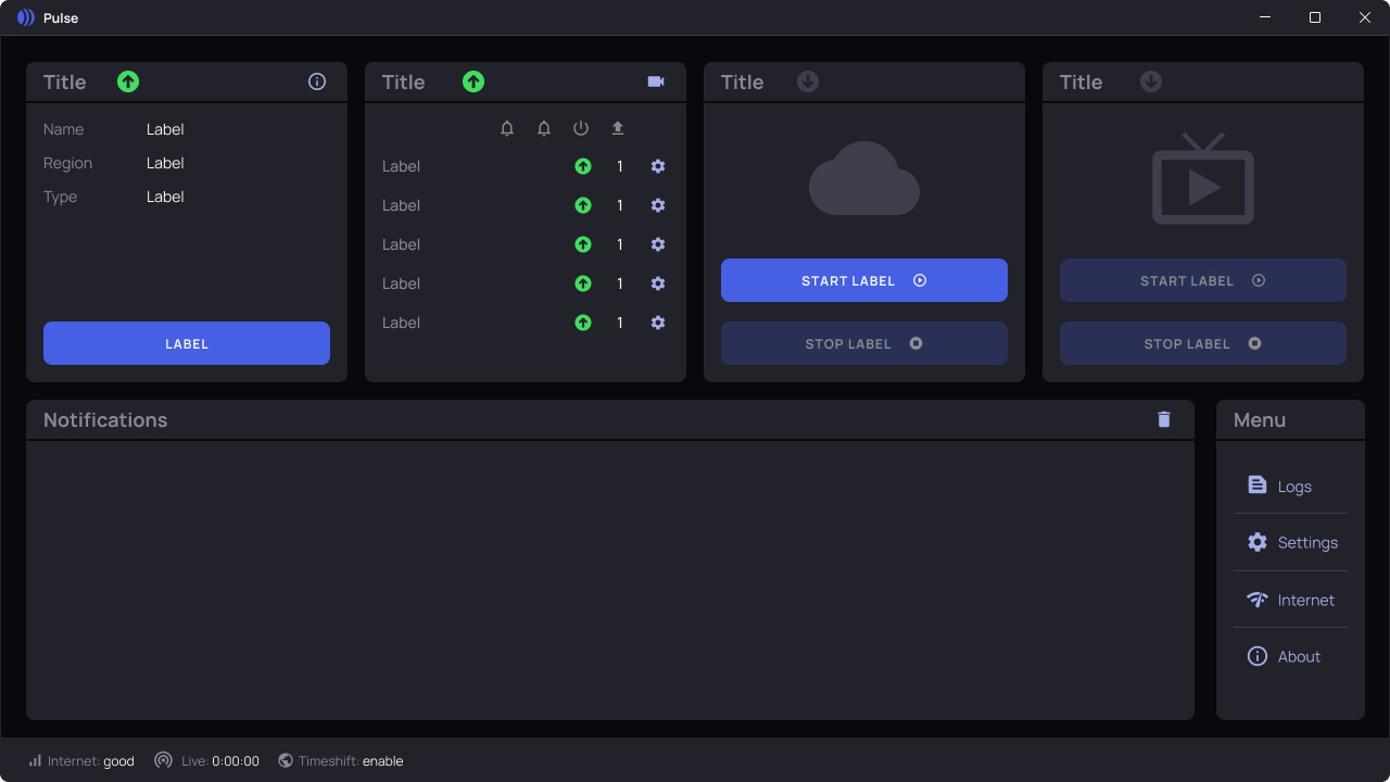
Chosen Methodology
To achieve our objectives, I employed a combination of qualitative research and evaluative design practices to understand how Pulse was being used, where friction points existed, and how the tool could better support the workflows of the operations staff.
Stakeholder Interviews
Conducted in-depth sessions with internal stakeholders, senior leadership, developers, and operators, to uncover expectations, technical constraints, and high-priority pain points.
User Interviews & Task Walkthroughs
Led interviews with regular users of the tool to observe how they interacted with the interface during typical workflows. This helped identify usability bottlenecks and gaps in the current design.
Heuristic Evaluation
Assessed the existing legacy interface against usability heuristics to document violations in clarity, feedback, and UI consistency.
Comparative Analysis
Benchmarked similar monitoring or ingest platforms to identify common design patterns and UX opportunities relevant to real-time video workflows.
Experience Mapping
Created flow diagrams of current tasks (like starting a stream, checking logs, or monitoring agent status) to visualise friction and propose smoother alternatives.
From Pain Points to Needs
To understand how Pulse was actually being used, I interviewed key stakeholders, senior leadership, developers, and operations staff. Each pain point below surfaced in those sessions and mapped directly to a design requirement, nothing here is assumed.
| Pain Point | Need |
|---|---|
| Ambiguous Status Signals Unclear or inconsistent status indicators cause confusion about system health and readiness. |
Clear Status Indicators Users need immediate and understandable visual feedback on the status of all ingest agents and processes. |
| Overwhelming Log Data Users struggle with excessive or complex logs, making troubleshooting time-consuming. |
Intuitive Monitoring Tools Access to simplified logs and graphical monitoring helps users quickly identify and resolve issues. |
| Cumbersome Workflows Inefficient processes demand too much manual intervention, slowing down operations. |
Reliable Control Mechanisms Users require straightforward controls to efficiently start, stop, and configure streaming tasks. |
Personas & Empathy Maps
Those interviews became personas and empathy maps capturing each group's motivations, frustrations, and daily workflows, giving the team a shared reference point for user needs throughout the project.
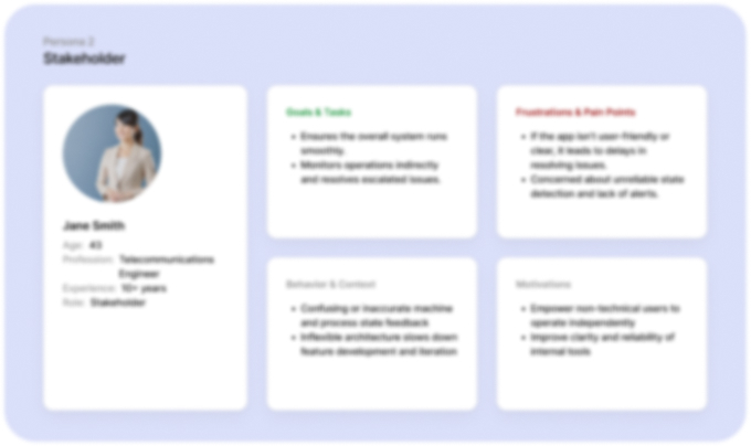
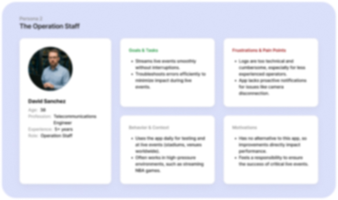
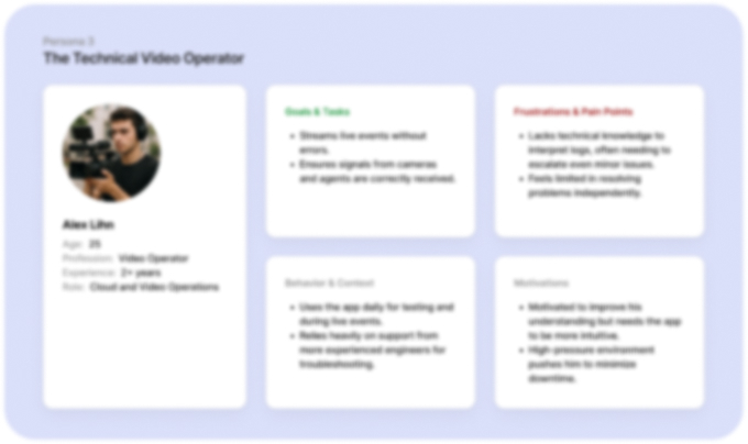
User Flows & System Architecture
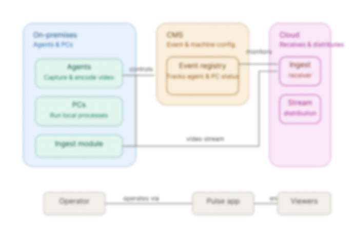
We mapped out the key operator flow, covering the full lifecycle of starting and stopping a live stream to ensure every critical action was intuitive and frictionless, with minimal steps and clear guidance to reduce errors during time-sensitive operations. Alongside this, we documented the system architecture to align the team on how data and signals flow across the platform, grounding design decisions in the technical reality operators work within.
Operator Flow
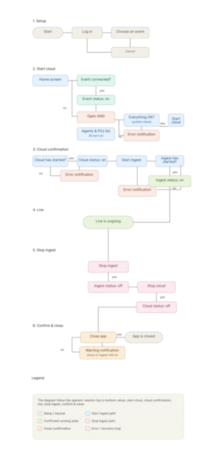
System Architecture
Outcomes
Research and interviews uncovered key pain points and opportunities that shaped the design process. These insights guided ideation and iterations focused on improving usability, workflow clarity, and real-time monitoring, resulting in a more intuitive and efficient tool.
Key Findings
- Status and machine states needed a consistent visual language (colours, icons, grouping)
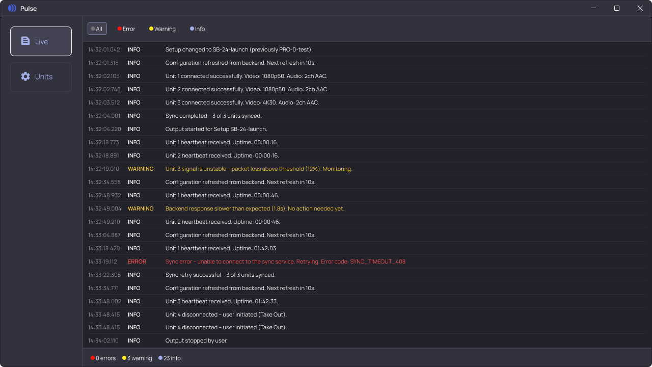
- Logs needed a hierarchy and clearer priority indicators (errors vs. warnings)
- Users needed to preview uploads/images for faster troubleshooting
- Layout and controls should follow Windows patterns to reduce cognitive load
Ideation & Design
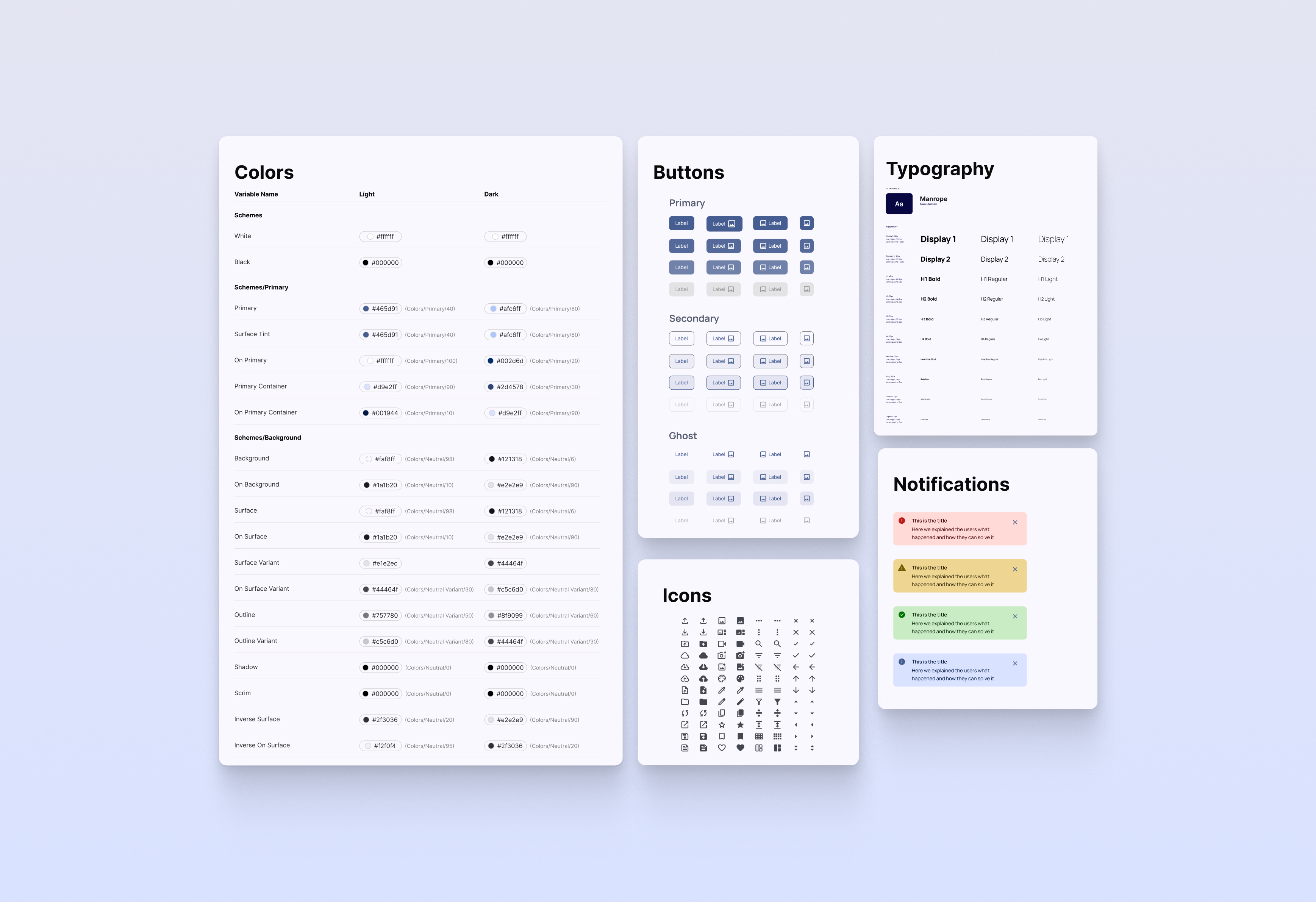
- Created visual system with clear status icons (green/grey/red) and grouped machine blocks
- Designed a collapsible log section with filtered views by severity and timestamps
- Added a monitoring section with preview snapshots of images and incoming streams
- Reorganised top-level navigation into "Machines," "Processes," and "Monitoring"
- Applied UI standards to buttons, forms, and modal behaviour, aligning with platform conventions
Reading System Health in Under a Second
Operators weren't reading screens, they were reading system health. Every machine and every log line needed an unambiguous state at a glance, especially mid-incident, when there's no time to parse a paragraph of text.
| Idle | Not currently ingesting or processing |
| Synching | Synchronizing data before streaming or processing resumes |
| Running | Actively streaming, healthy |
| Error | Needs operator attention now |
| Info | Expected system activity |
| Warning | Degraded but not blocking |
| Error | Blocking, surfaced above the fold |
Wireframes & Mockups
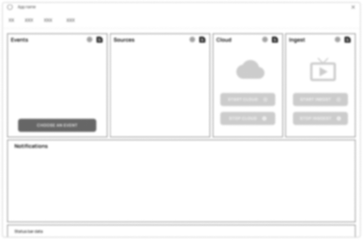
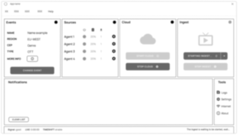
Wireframing focused on refining the existing interface to respect users' familiarity while enhancing clarity and usability. The goal was to improve workflows without disrupting the core experience operators have relied on for years. From low-fidelity sketches to high-fidelity mockups, each iteration brought greater detail and precision, translating validated ideas into a polished, production-ready interface.
All data, section names, and branding shown are fictitious. This mockup has been modified from the original to comply with a confidentiality agreement.
Low-Fidelity Wireframes
Where the redesign started,early structure before any visual polish.
From Pain Point to Fix
Each fix maps directly back to a finding from the interviews.
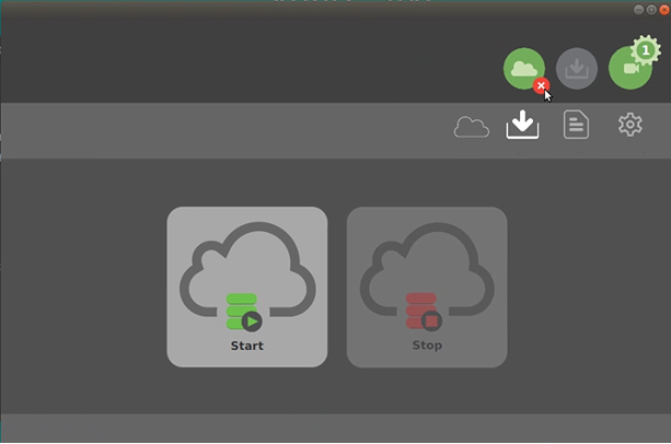
Sync and output lived on separate tabs. Switching between them was the only way to manage a single streaming session.
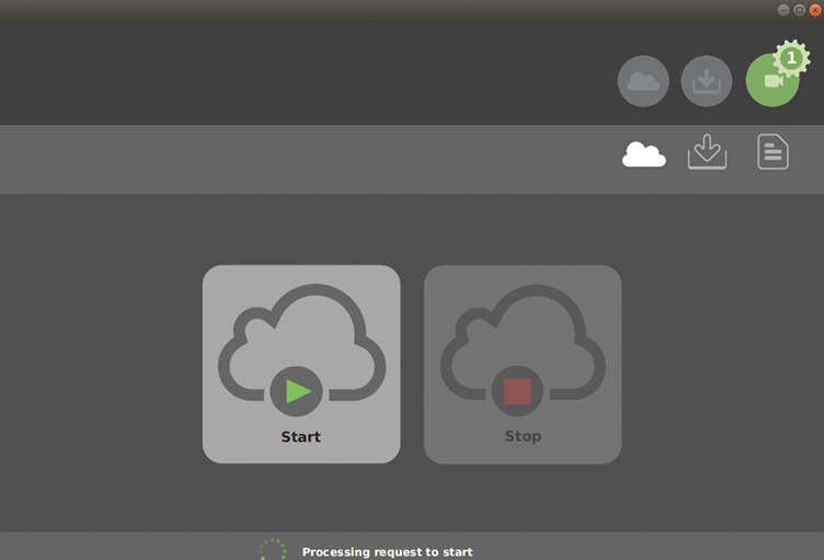
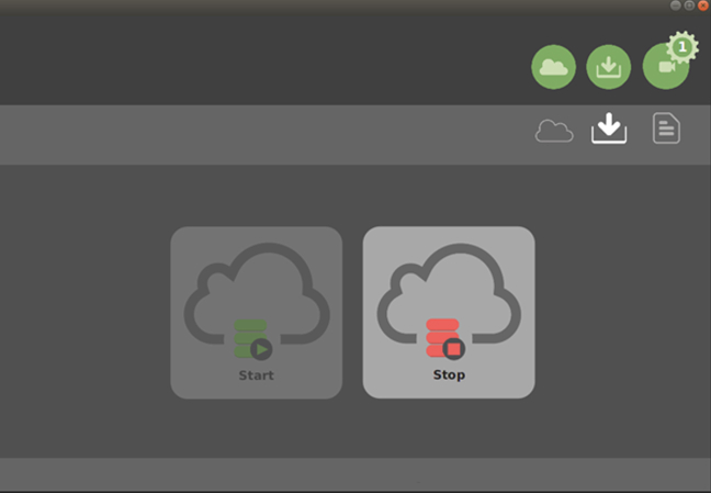
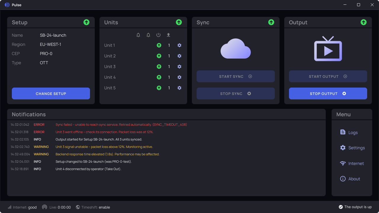
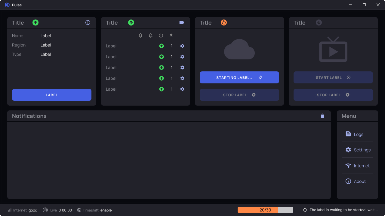
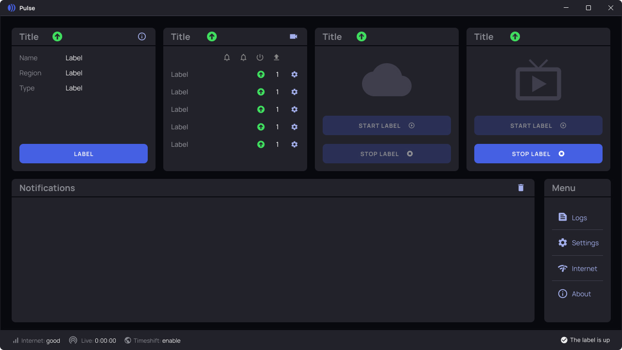
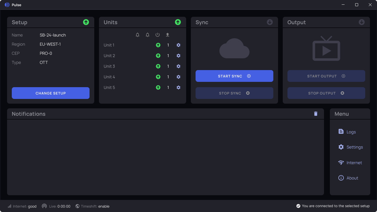
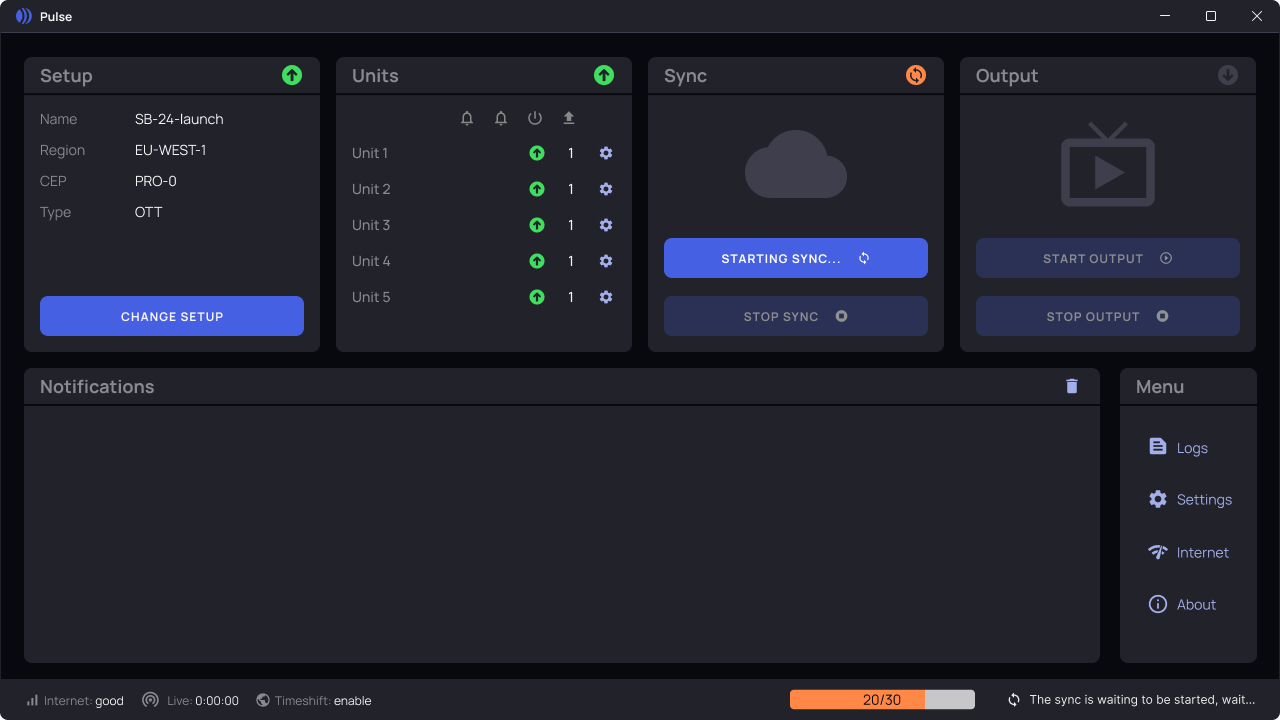
The same card, three moments in the same session: color, icon, and button label all shift together, so an operator reads the state without parsing text.
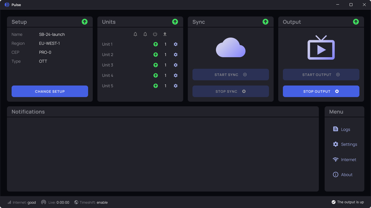
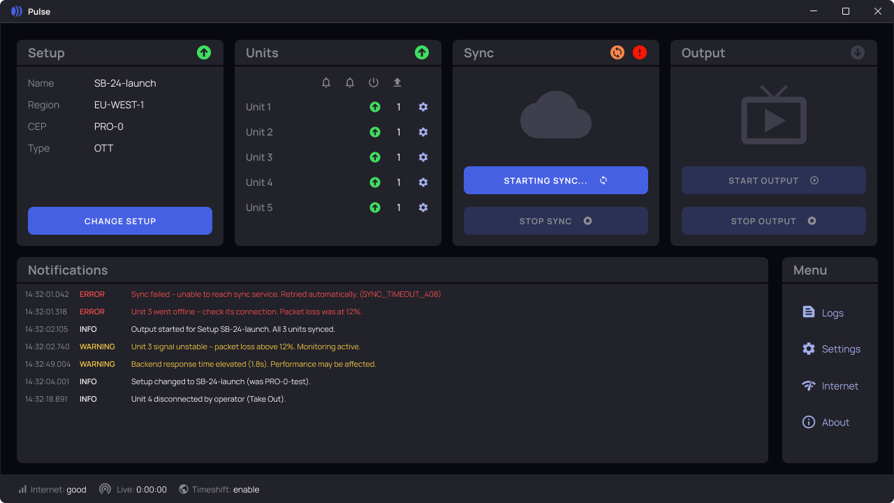
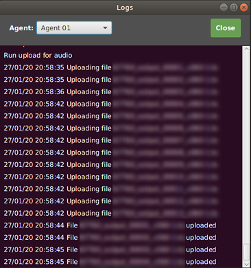
Errors weren't visible on the dashboard, and the logs that were supposed to help didn't distinguish them either.
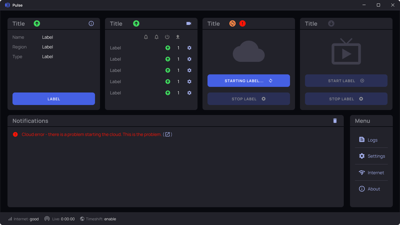
Design Solution
Familiar, Refined, and Ready for Use
The final design preserves the essence of the original tool while introducing a clearer structure, improved visual hierarchy, and simplified interactions. It balances familiarity with usability upgrades, ensuring long-time operators feel at home while benefiting from a more efficient and intuitive experience. See it for yourself in the interactive prototype below.
The interactive prototype uses the same fictitious data and redacted branding as the mockups above.
Click through the real login → dashboard → log viewer flow
Impact
- Consolidated three separate views (Machines, Processes, Monitoring) into a single dashboard, with a color-and-icon system flagging errors and warnings operators previously had no way to distinguish at a glance
- Fewer errors during stream setup, thanks to clear at-a-glance status instead of raw logs
- Reduced day-to-day reliance on backend support, since operators could now self-diagnose issues from the dashboard
Learnings
- Even small UX patterns (like preview thumbnails or grouped states) dramatically improve confidence for ops users
- Collaborative prototyping sessions with backend and ops team were crucial to ensure realistic solutions
- Designing for legacy environments requires prioritising what to fix now vs. long-term refactors